Never combine these colors in your interior
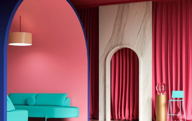 What colors should not be combined in the interior (photo: Freepik)
Color plays a key role in interior design. Correctly selected combinations create a harmonious space, and unsuccessful ones can ruin even the most expensive renovation.
Red and green: a festive overkill
The combination of red and green is often associated with the New Year holidays. In interior design, these colors together look too bright and aggressive, which can cause discomfort.
Red, which symbolizes energy, and green, which is associated with nature, together create a contrast that irritates the eye. Even as accents, these two colors are difficult to harmonize.
If you like green, it's better to combine it with neutral tones, such as white or gray. And red looks good next to cream or gold. In this way, you will avoid the "New Year's" effect and maintain balance in the room.
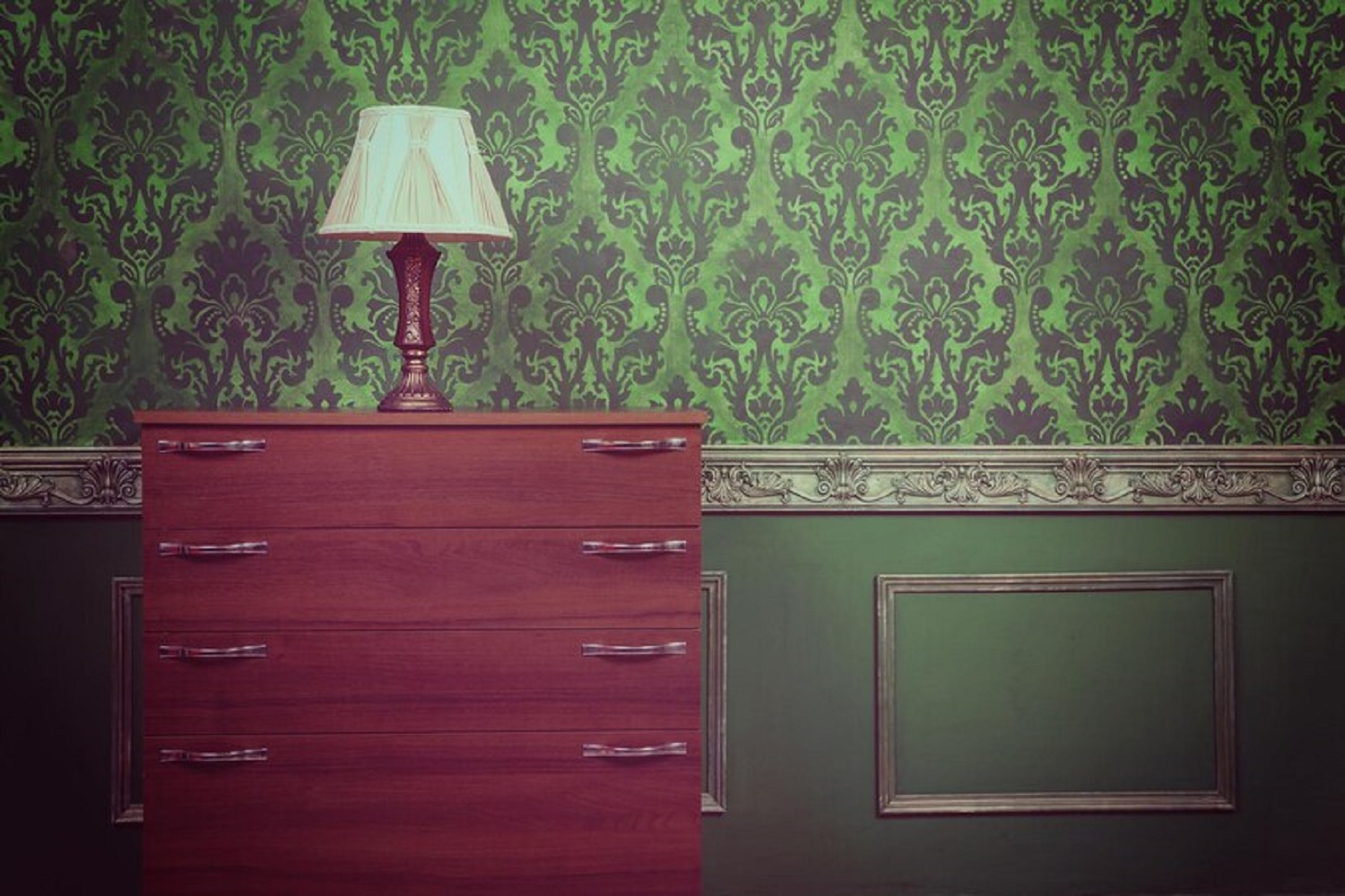 Green and red - a dangerous combination (photo: Freepik)
Yellow and purple: a contrast that cuts the eye
Yellow and purple are opposite colors on the color wheel, so their combination is very strong. This contrast can be too dramatic for the interior, causing fatigue and overload. This is especially true for saturated shades such as bright lemon and deep eggplant.
If you want to use these colors, choose pastel versions of them, such as pale yellow and light lavender. Or use one of them as an accent, leaving the other in the background. It's important to remember that the interior should be balanced and not cause unnecessary tension.
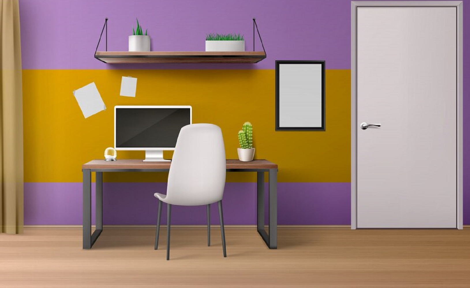 Purple and yellow together look terrible (image: Freepik)
Orange and pink: dangerous proximity
Orange and pink are two warm colors that together create a "color explosion" effect. They can look chaotic and tasteless, especially in large proportions. It's easy to feel overwhelmed by the color in a room with this combination.
If you want to use these shades, you should add neutral colors, such as white or beige, to balance the space. For example, pink accents look good with wooden textures, and orange is best combined with calm shades of gray.
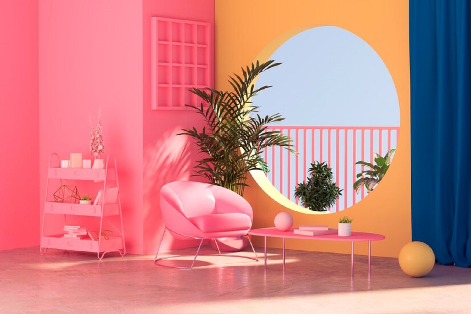 Although orange and pink are warm colors, they should not be combined (image: Freepik)
Blue and brown: heaviness in space
Blue and brown are two deep colors that together create an excessively dark and heavy interior. Brown is often associated with wood and stability, while blue is associated with cold and calm. However, together they can make a room look gloomy and visually smaller.
To avoid this effect, add light accents such as white, cream, or pale blue. This will help to dilute the heaviness of the combination and create a more harmonious space. In addition, it is better to choose lighter shades of blue, such as sky blue or turquoise, paired with brown.
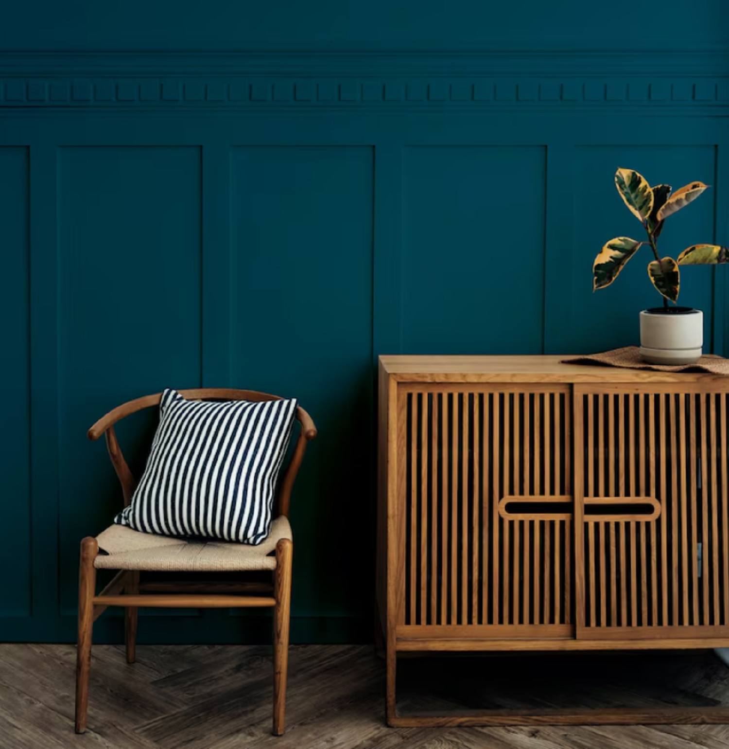 The combination of blue and brown looks very gloomy (photo: Freepik)
Black and yellow: dangerous aggression
Black and yellow is a combination that is often associated with warning signs or stripes on the road. In interior design, this combination looks too aggressive and can cause a feeling of anxiety.
Black, as a base color, works well with softer and warmer shades, such as pastel yellow. Yellow, in turn, can be combined with white or gray to create a more comfortable space.
If black and yellow are really necessary in the interior, use them in a very dosed manner, for example, in the form of decorative elements. This approach will help to avoid oversaturation of the space.
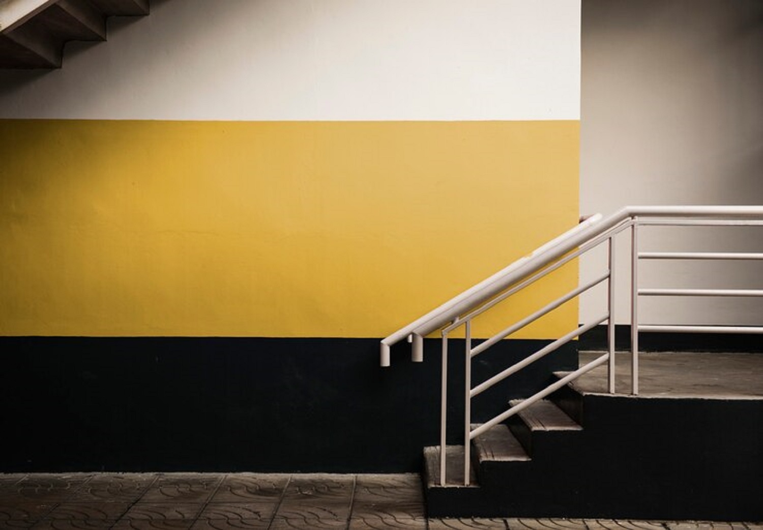 Yellow and black resemble dangerous insects (photo: Freepik)
Read also, how to decorate bare walls in a stylish and inexpensive way.
Sources: Apartment Therapy, Homes and Gardens, Forbes Home.

