WhatsApp overhauls design for Android and iOS
 Developers radically updated the design of WhatsApp for Android and iOS (photo: Pexels)
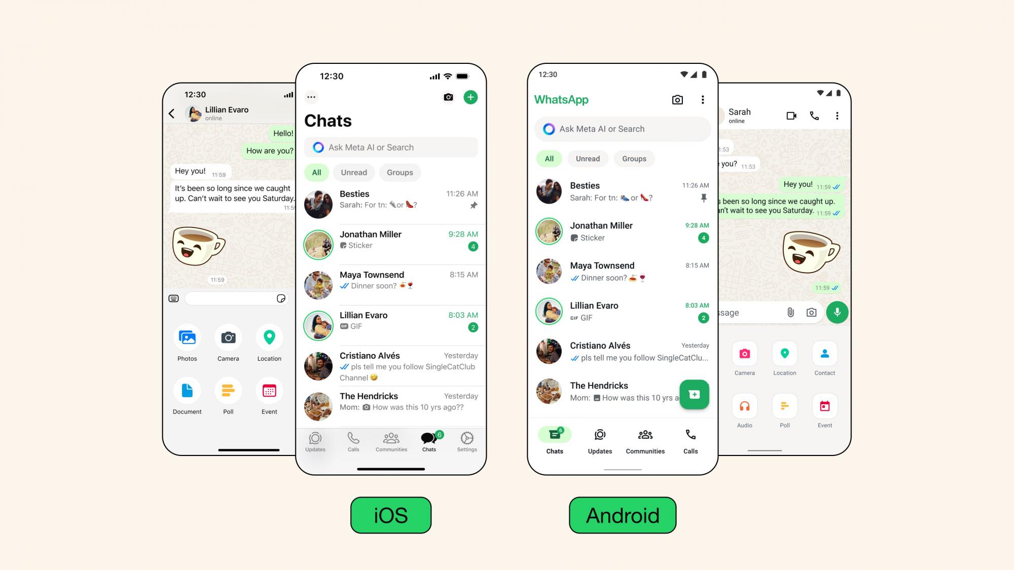
This week saw the release of a significant update for the mobile versions of the WhatsApp application. After its installation, Android and iOS device users will be able to experience the refreshed interface aimed at enhancing the user experience with the app, according to the leading news website for iPhone, iPad, and Mac, 9to5Mac.
What changes will occur
First and foremost, notable changes are observed in the color palette of the interface. Now, the green color has become accentuated and is used to highlight notification icons and buttons.
In the Android version of WhatsApp, more significant changes are observed: the navigation panel has been moved to the bottom of the screen, making the app more similar to the iOS version.
 What's new in the update (photo: X/WABetaInfo)
As for the dark mode, WhatsApp claims that the change in the color palette will provide higher contrast and richer dark shades to reduce eye strain in low-light conditions.
Developers note that users expressed a desire to see a darker mode, so it was implemented in the app.
 The difference between iOS and Android in the new update (photo: X/WABetaInfo)
In the message from the developers, it is stated that their goal is to make WhatsApp a simple, reliable, and confidential application. The changes in the product's design are aimed at improving communication between users, making their interactions more convenient.
One of the main objectives set by the developers is to create the most user-friendly version of WhatsApp, and they strive to achieve it.
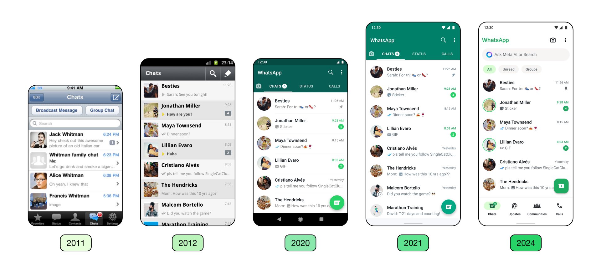
 The evolution of WhatsApp updates (photo: X/WABetaInfo)


